Accessible Web Empowering Inclusive Online Experiences
Accessibility is a big inspiring topic. It's all about making something accessible and reachable to everyone regardless of disabilities, impairments, and environmental factors.
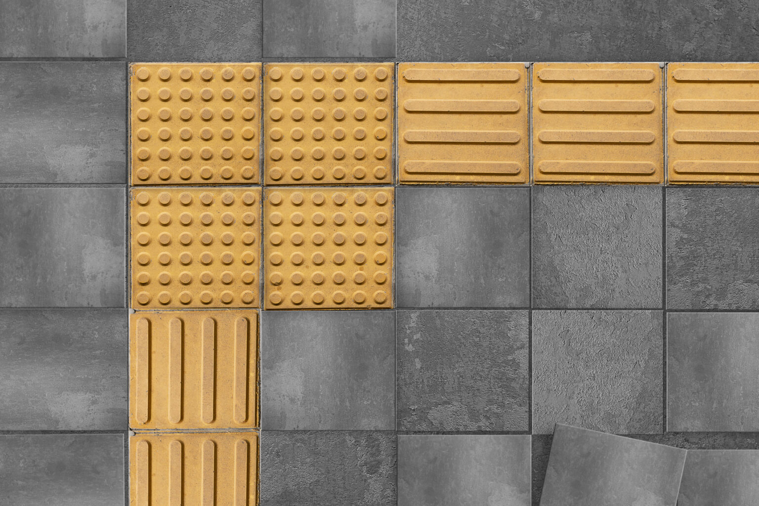
These are tactile pavements. The textured ground surface indicators are easier to detect with a cane or foot. It warns you of the edge of the platform or dangerous areas, guides the pedestrians crossing the road, telling you when to stop.

These are low-floor buses with the primary goal of avoiding stairs, making it quicker and easier to get in and grab a seat. You can easily walk in through the low-floor buses with a baby carriage. An older adult can quickly get inside with minimal effort and safely.
There are many other inventions that is helping people with impairments.
As a developer, what about you?
Have you ever thought of such scenarios where a disabled person is trying to access your content? As a developer, You are always concerned about beautifying your website/web app and making it look great. In the process, sometimes we tend to assume all users can see, use a keyboard, use a mouse, and touch to interact with your page. But that's not always the case unless you target a specific group of users to use your application. If you have built the application for the public, then the types of users vary. So while building an application, we need to think of every possible user that can use the application like:
- A person who has low or no vision.
- A person with low contrast sensitivity, which is common in older people.
- A person with color blindness who cannot distinguish between specific colors.
- A person who cannot hear.
- A person with a broken arm.
- A person whose mouse just fell and broke.
- A person who cannot understand specific languages.
- A person who needs to work on a sunny day on a laptop.
- A person in a place where the internet is very slow or very expensive.
- A Person with cognitive and learning disabilities.
Ways to make your content accessible:
- HTML semantics and aria: The HTML semantics and aria attributes while web development should be coded and followed carefully, because screen reader/voice recognition tools depends on it. This will also give you a added benefit while SEO ranks your site.
- Contrast: Colors must have sufficient contrast between text color and its background (technically called luminosity contrast ratio). It is equally applicable to links, buttons, and icons. If it's important enough to be seen, then it needs to be precise. Even if you are trying to access content in your device in bright sunlight, it needs to adapt.
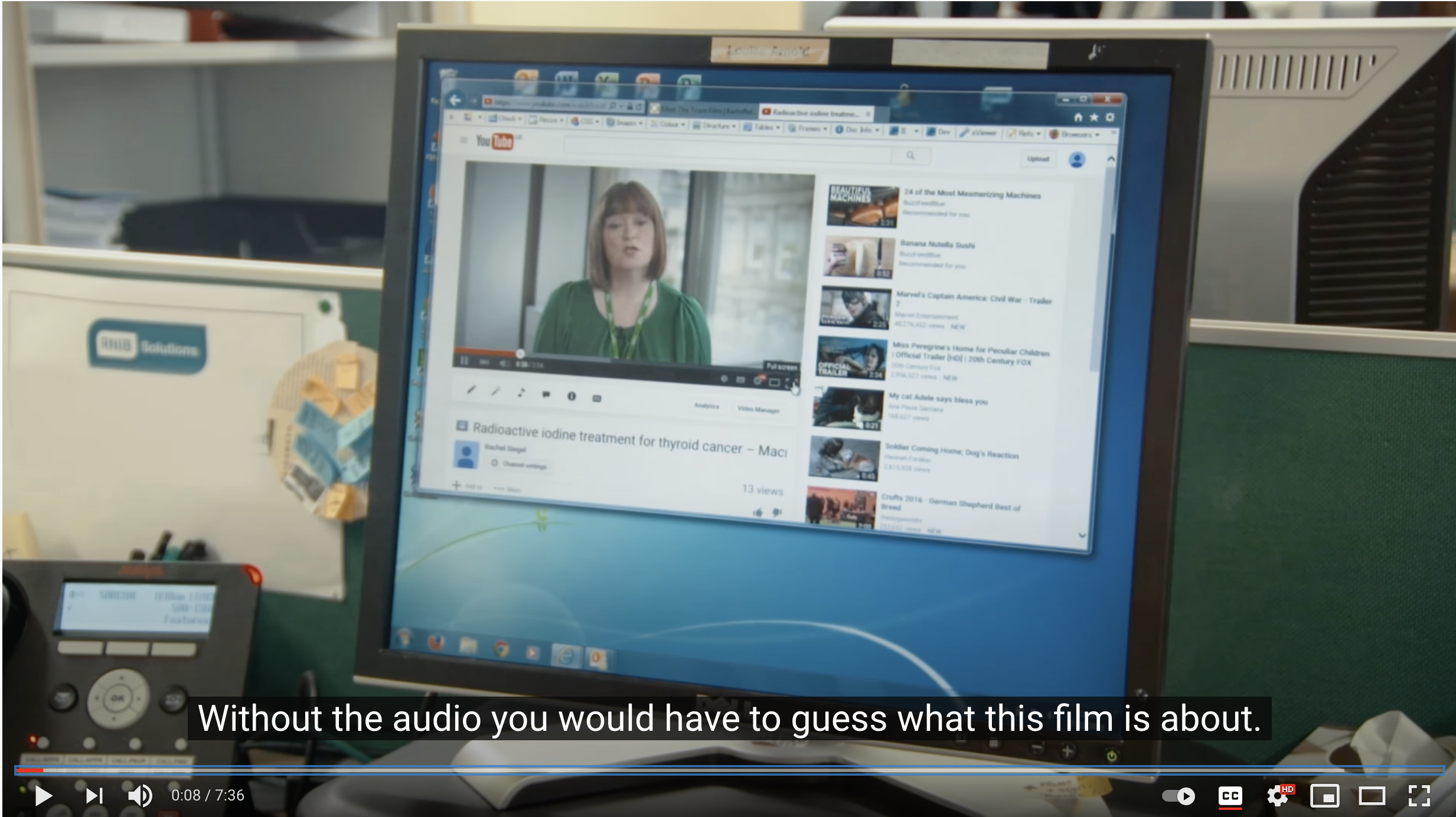
- Video captions: Captions are a must in the case of audiences that have hearing impairments. Captioned content does not only help those who cannot hear but also help those sets of people who are surrounded by the crowd. Or people who are in a library where you are not allowed to produce sound.
- Keyboard accessibility: Consider a person who is trying to access the application but does not have a mouse. To make your website keyboard accessible, you should define the layouts with correct HTML elements. For eg. if you are using a div and styling it beautifully to make it look like a button, then I'll call it a dead thing that wont be accessible from keyboard. Also, you should never be removing the focus rings that you see around your components just because your designer yells at you saying it does not look good. Instead, you should try to convince them about the usability of it while you are only on keyboard.
- Larger links, buttons and targets: It may not be a problem for a desktop user to click on a small target using a mouse, but consider a person who is using the same application on his/her mobile and trying to tap with a finger. It would be an awful experience.
- Simple enough content: Contents should not be vague but easily understandable by any layperson.
- Clear layout and designs: Clear headings, navigation bars, and consistent styling is key to a clear layout and designs. This gives our web users a better experience and limits them from getting confused and become frustrated.
- Clear notifications and feedbacks: If you don't get the response you are expecting; then you will feel like there is something wrong and won't be sure what you did actually worked out. Easily understandable feedbacks should be given regarding error and success messages.
- Text customization: Being able to customize text sizes, font, spacings, and colors are crucial for low vision people and those who suffer from dyslexia. We should always give users an option to change them on their preferences. Essential for some, useful for all.
Up next: Building accessible web
Research and links
https://pineco.de/accessibility-in-real-life/