Unlocking Storybook Features Exploring Essential Components and Add-Ons
Storybook is widely used in building live playgrounds and documenting component libraries, as you have the power to change props values, check loading states amongst other defined functionalities.
Storybook doesn't stop with just adding components, it provides the ability to configure Addons that enhance the core capabilities opening up a lot of possibilities.
Addons
Addons extend Storybook with features and integrations that are not built into the core. Most Storybook features are implemented as addons.
In this article, I will walk you through the basic features of the storybook which I came across while working on sage-ui.
Here are some with which I am familiar of...
Controls
Storybook controls let us interact with the component’s arguments dynamically without changing the code. It creates an addon Control panel, so you can update your component live. Controls is part of essentials and so is installed in all new Storybooks by default. If you're running sb init to add Storybook to your project, the essentials package @storybook/addon-essentials is already installed and configured for you. If you are using the older version of storybook you can install addon control by running the command below.
npm i -D @storybook/addon-controls
And then, add the following content in .storybook/main.js.
module.exports = {
  addons: ["@storybook/addon-controls"],
};
Storybook Controls will render all the props of the component by matching its prop type by default. If we want to customize it, we can pass the args with the argTypes property.
Here is the full list of available controls you can use:
| Data Type | Control Type | Description | Options | | --------- | ------------ | -------------------------------------------------------- | -------------- | | boolean | boolean | checkbox input | - | | number | number | a numeric text box input | min, max, step | | | range | a range slider input | min, max, step | | object | Object | json editor text input | - | | array | object | json editor text input | - | | | file | a file input that gives you a array of urls | accept | | enum | radio | radio buttons input | - | | | inline-radio | inline radio buttons input | - | | | check | multi-select checkbox input | - | | | inline-check | multi-select inline checkbox input | - | | | select | select dropdown input | - | | | multi-select | multi-select dropdown input | - | | string | text | simple text input | - | | | color | color picker input that assumes strings are color values | presentColor | | | date | date picker input | - |
Here is the example how we can pass the args with the argTypes.
export default {
  title: "Components/Avatar",
  component: Avatar,
  argTypes: {
    size: {
      options: ["xs", "sm", "md", "lg", "xl"],
      control: {
        type: "select",
      },
    },
  },
};
We set the size of Avatar to be set by the options with the control type set to 'select'.
The description of props in Controls is not visible by default. we can make it visible by passing expanded to true of control like that.
export default {
  title: "Components/Avatar",
  component: Avatar,
  parameters: {
    controls: { expanded: true },
  },
};
Storybook automatically gets all the comments of jsDocs as a description of prop. If we want to customize it we can set description manually like that.
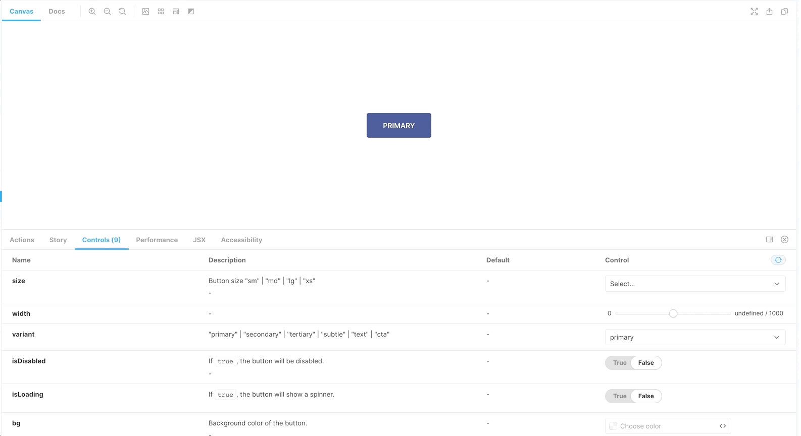
export default {
  title: 'Components/Button',
  component: Button,
  argTypes: {
   size: {
      options: Object.keys(ButtonSizes),
      description: 'Button size "sm" | "md" | "lg" | "xs"',
      control: {
        type: 'select',
      },
    },
    width:{
      control:{
        type:"range",
        max:1000
      }
    },
    variant: {
      description:
        '"primary" | "secondary" | "tertiary" | "subtle" | "text" | "cta"',
      options: Object.keys(ButtonVariants),
      control: {
        type: 'select',
      },
    },
    ...
  },
};

export const Base = (args: ButtonProps) => <Button {...args} >{args.variant}</Button>
Story source
When building a component system, the purpose is that anyone can easily use these components. But if you don't have documentation, someone would have to open up the file or try to find another use example.
Alternatively, Story Source displays the source code of the story file you created, lets someone browsing your Storybook dashboard to get an example right along with the component output!
You can install it by using that command.
npm install -D @storybook/addon-storysource
Add the following code in .storybook/main.js to make it work.
module.exports = {
  addons: ['@storybook/addon-storysource'],
};
Displaying full source
Storybook 6.0 introduced an unintentional change to source-loader, in which only the source of the selected story is shown in the addon. To restore the old behavior, pass the injectStoryParameters: false option.
If you are using addon-docs:
module.exports = {
  addons: [
    {
      name: "@storybook/addon-docs",
      options: {
        sourceLoaderOptions: {
          injectStoryParameters: false,
        },
      },
    },
  ],
};
if not:
module.exports = {
  addons: [
    {
      name: "@storybook/addon-storysource",
      options: {
        loaderOptions: {
          injectStoryParameters: false,
        },
      },
    },
  ],
};
Docs
Storybook Docs transforms your Storybook stories into component documentation. When we write component stories during development, we can also create basic documentation.
You can install it using that command:
npm install -D @storybook/addon-docs
Then add the following in .storybook/main.js:
module.exports = {
  stories: ["../src/**/*.stories.@(js|mdx)"],
  addons: ["@storybook/addon-docs"],
};
When you install addon-docs in your project you get auto generated component documentation by pulling information from your stories, components, source code, and story metadata.
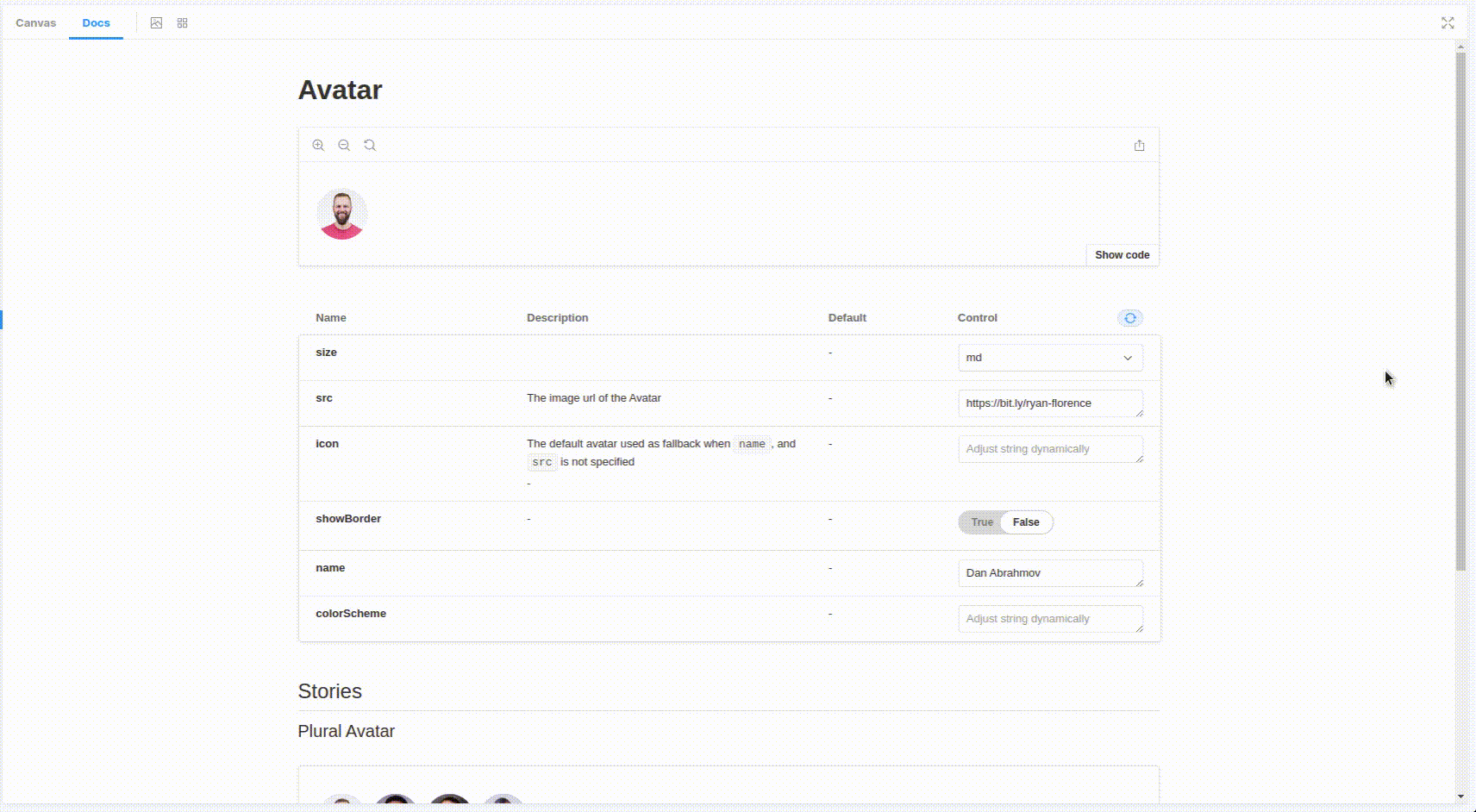
We can write our own documentation for every component if we want to by creating MDX and add that doc in story like that:
import docs from "./Avatar.docs.mdx";

export default {
  title: "Components/Avatar",
  component: Avatar,
  parameters: {
    controls: { expanded: true },
    docs: {
      page: docs,
    },
  },
};
Here's an example file Avatar.docs.mdx:
import { Story, Props, Source } from '../../../.storybook/components';

# Avatar

The Avatar component is used to represent a user, and displays the profile picture, initials or fallback icon.

<Story id="components-avatar--single-avatar" />

# Avatar Group

In some cases, you might need to stack avatars as a group. Use the AvatarGroup component.

## Plural Avatar

<Story id="components-avatar--plural-avatar" />

## Stack Avatar

<Story id="components-avatar--stacked-avatar" />

# Props

Avatar Props

<Props />


# Note:

No longer support for SIZE.XSMALL (XSMALL) and so on. Consider using sm for 'XSMALL' likewise md, lg, xl, full.
And here's how that's rendered in Storybook:
For more can see this documentation.
"I will be writing on more features of storybook soon", till then Happy Story making!!